
Every small change in user interface design can lead to a substantial enhancement in user experience. Are you ready to transform your product's design by implementing simple yet effective fixes?
What You Will Learn
- Skeleton screens improve loading perception and reduce user frustration.
- Tooltips provide immediate context, aiding navigation.
- Simplified navigation leads to intuitive user journeys.
- Progressive disclosure helps users digest information easier.
- Clear call-to-action elements enhance user decision-making.
- Consistent design builds trust and professionalism.
- Social proof enhances product credibility.
- Accessibility ensures inclusivity for all users.
Eight Tiny UI Improvements for Enhanced Perceived Intelligence
The following visual illustrates eight UI improvements that significantly enhance user perception and product intelligence, categorized for clarity.
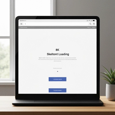
1. Skeleton Screens
Reduce perceived wait times and frustration by displaying placeholders during loading.
2. Tooltips
Provide immediate context for complex features without cluttering the UI.
3. Simplified Navigation
Create intuitive user journeys by limiting menu items and consistent labeling.
4. Progressive Disclosure
Prevent cognitive overload by presenting information in manageable chunks.
5. Clear CTAs
Guide user decisions and interactions with action-oriented and visually distinct calls-to-action.
6. Consistent Design
Build user trust and reinforce brand identity with a cohesive look and feel across all interfaces.
7. Social Proof
Enhance product credibility and user confidence by showcasing testimonials and reviews.
8. Accessibility
Ensure inclusivity and broaden audience reach by making products usable for everyone.
Transformative UI Fixes for a Smarter Product
The importance of user interface (UI) design cannot be overstated when it comes to enhancing user experience and product perception. At The Stone Builders Rejected, we recognize that a well-crafted UI speaks volumes about a product's intelligence and usability. Even small changes in UI design can lead to significant improvements, fostering user satisfaction and trust. For a deeper understanding of UI design principles, you can refer to resources like Interaction Design Foundation's comprehensive guide on UI Design.
Think about your own experiences: Have you ever left a website simply because you couldn't find what you were looking for? It’s frustrating! That's why it's crucial to consider how every element in the UI contributes to the user journey. A few thoughtful tweaks can make a world of difference!
Understanding User Impact: Why Small Changes Matter
When we talk about UI, we’re really discussing the user’s interaction with a product. This encompasses everything from layout and colors to the responsiveness of buttons. Each element plays a part in how users feel about the product. In fact, research indicates that a well-designed interface can increase user engagement by up to 200%! For more tips on effective UI/UX design, consider exploring articles like DesignBro's guide on UX/UI design tips.
- First impressions count: A clean and intuitive UI can establish immediate trust.
- Retention boosts: Users are more likely to return if they find the interface easy to navigate.
- Brand identity reinforcement: Consistent design elements solidify your brand image in the user's mind.
By focusing on these aspects, we can enhance users' perceptions and make our products feel smarter and more responsive to their needs. At The Stone Builders Rejected, I’ve seen firsthand how even minor adjustments lead to more satisfied users and better engagement metrics.
Eight Tiny UI Improvements to Enhance Perceived Intelligence
1. Implementing Skeleton Screens for Improved Loading Perception
Skeleton screens are a clever way to enhance user experience during loading times. Instead of staring at a blank screen, users see a placeholder that indicates content is on the way. This not only alleviates frustration but also creates a perception of speed and efficiency in your application.
- Skeleton screens manage expectations during loading.
- They provide immediate feedback, which is essential for user satisfaction.
- Implementing skeleton screens can reduce perceived wait times by keeping users engaged.
Incorporating this simple fix can transform a mundane loading experience into one that feels dynamic and responsive!
2. Adding Tooltips to Guide User Navigation
Tooltips can be game-changers in providing immediate context to users, especially for complex features. By offering brief explanations, you can minimize confusion and ensure users feel supported throughout their journey. I often remind my team at The Stone Builders Rejected that clear guidance can enhance the overall experience!
- Tooltips clarify functions without cluttering the UI.
- They empower users to explore features confidently.
- Contextual help can significantly reduce the learning curve.
By using tooltips effectively, we guide users and help them feel more connected to the product.
3. Simplifying Navigation for Intuitive User Journeys
Streamlined navigation is critical for enhancing usability. If users can’t find what they need swiftly, they might abandon the product altogether. Our goal should be to make navigation as intuitive as possible. Here are some best practices we've adopted:
- Limit menu items to essential categories.
- Ensure consistent labeling for easy recognition.
- Implement breadcrumb trails to enhance orientation.
These strategies can significantly improve user journeys and make your product feel intelligent and efficient!
4. Utilizing Progressive Disclosure to Reduce Cognitive Overload
Progressive disclosure helps users absorb information in manageable chunks, preventing cognitive overload. By presenting only what they need to know at each step, products can feel more organized and less overwhelming. It's a clever tactic that I often emphasize when discussing user engagement strategies at The Stone Builders Rejected. For further reading on effective UI/UX design, explore resources like Ashutec's tips and practices for UI/UX design.
- Start with essential information and options.
- Reveal advanced features as users become more comfortable.
- Maintain a clean interface to enhance focus.
This method ensures users can navigate with ease, making your product seem more intuitive and responsive to their needs.
5. Incorporating Clear Call-to-Action Elements
Well-defined calls-to-action (CTAs) can greatly influence user decisions and engagement. A compelling CTA not only directs users but makes their interactions feel more purposeful. In practice, this means being clear about what action you want users to take next.
- Use action-oriented language to inspire clicks.
- Design CTAs that stand out visually.
- Place CTAs logically within the user journey.
By mastering CTAs, we can guide users seamlessly through their experience, enhancing their perception of our product's intelligence.
6. Using Consistent Design Elements to Build Trust
Consistency in design is key to building user trust. It reflects professionalism and reinforces the user’s confidence in the product. By maintaining a cohesive look and feel across all interfaces, users are more likely to perceive your product as credible and reliable.
- Use a consistent color palette throughout your platform.
- Implement uniform typography for brand recognition.
- Ensure similar button styles and interaction cues.
Each time users recognize familiar elements, they become more comfortable and engaged with your product.
7. Building Social Proof to Enhance Product Credibility
Testimonials and user reviews can significantly enhance trust and credibility. By showcasing positive feedback, you can reassure potential users about the product's value. At The Stone Builders Rejected, I have seen how powerful social proof can be in influencing user decisions!
- Display testimonials prominently on landing pages.
- Encourage users to leave reviews after experiences.
- Highlight user-generated content to foster community.
When users see that others have had positive experiences, they are more likely to engage with your product.

8. Prioritizing Accessibility in UI Design
Accessibility should be a priority in UI design, ensuring that products are usable for everyone. This approach not only broadens your audience but also demonstrates inclusivity. Here are some actionable tips to enhance accessibility:
- Use high-contrast colors for readability.
- Ensure keyboard navigation is intuitive.
- Provide alt text for images and media.
By making UI design accessible, we create a more inclusive experience that resonates with a wider audience, enhancing overall product intelligence.
We Want to Hear From You!
Which of these UI improvements do you believe would have the most significant impact on your user experience? Share your thoughts below:
Frequently Asked Questions About UI Improvements
- What are skeleton screens and how do they help user experience?
- Skeleton screens are placeholder elements displayed on a page while the actual content is loading. They reduce perceived wait times and user frustration by giving the impression that content is on its way, making the loading experience feel more dynamic and responsive.
- Why is simplified navigation important for a product?
- Simplified navigation is crucial for intuitive user journeys. By limiting menu items to essential categories, using consistent labeling, and implementing breadcrumb trails, users can find what they need quickly and efficiently, preventing frustration and increasing engagement.
- What is progressive disclosure and how does it prevent cognitive overload?
- Progressive disclosure is a UI technique that presents information in manageable chunks. It starts with essential information and options, revealing more advanced features only as users become more comfortable. This method prevents cognitive overload by not overwhelming users with too much information at once, making the product feel more organized and intuitive.
- How do clear calls-to-action (CTAs) enhance user decision-making?
- Clear CTAs guide users through their experience by using action-oriented language, standing out visually, and being placed logically within the user journey. They make interactions feel more purposeful, influencing user decisions and encouraging engagement with the product.
- Why is consistent design important for building user trust?
- Consistent design builds user trust by reflecting professionalism and reinforcing confidence in the product. A cohesive look and feel across all interfaces, including consistent color palettes, typography, and button styles, makes the product appear more credible, reliable, and easier to navigate, fostering greater user comfort and engagement.
Summarizing Key Takeaways for UI Enhancements
As we've explored throughout this article, small UI changes can lead to significant improvements in user experience. Each of the tiny fixes we've discussed—from implementing skeleton screens to prioritizing accessibility—plays a crucial role in enhancing how users perceive and interact with products. Remember, these adjustments not only boost usability but also contribute to a more intelligent product feel.
Here’s a quick recap of the main points:
- Skeleton screens improve loading perception and reduce user frustration.
- Tooltips provide immediate context, aiding navigation.
- Simplified navigation leads to intuitive user journeys.
- Progressive disclosure helps users digest information easier.
- Clear call-to-action elements enhance user decision-making.
- Consistent design builds trust and professionalism.
- Social proof enhances product credibility.
- Accessibility ensures inclusivity for all users.
Incorporating these strategies can transform the user experience dramatically. As the founder of The Stone Builders Rejected, I can attest that embracing these thoughtful UI enhancements not only enriches interaction but also fosters engagement with your audience. Don't underestimate the power of small changes!
Harnessing Customer Feedback for Continuous Product Improvement
Listening to users is a game-changer in refining UI elements. By actively seeking and incorporating customer feedback, businesses can make informed decisions that elevate user satisfaction and engagement. For example, consider conducting regular surveys or usability tests to gather insights on your UI’s performance. These interactions can reveal pain points and highlight areas for improvement that you may never have noticed.
Here are some effective ways to utilize customer feedback:
- Conduct user interviews to gain in-depth insights.
- Implement feedback loops where users can suggest features or report issues.
- Analyze customer support queries to identify recurring concerns.
At The Stone Builders Rejected, we prioritize understanding our audience’s needs. Each piece of feedback is an opportunity to enhance our content and user experience, ensuring that we're always in tune with what our readers seek. Engaging with your users fosters a sense of community, making them feel valued and encouraging long-term loyalty.
Encouraging Action: Start Implementing UI Fixes Today
Now that we've covered these transformative UI fixes, I encourage you to start applying them in your product design. Each small step towards enhancing your user interface can lead to increased user satisfaction and greater product success. Imagine the impact of just a few of these changes!
Consider sharing your experiences with the fixes outlined in this article. Have you seen improved engagement or user satisfaction after implementing these adjustments? I'd love to hear your stories. Let’s foster a dialogue in the comments, as sharing insights can help us all learn and grow together!
Recap of Key Points
Here is a quick recap of the important points discussed in the article:
- Skeleton screens improve loading perception and reduce user frustration.
- Tooltips provide immediate context, aiding navigation.
- Simplified navigation leads to intuitive user journeys.
- Progressive disclosure helps users digest information easier.
- Clear call-to-action elements enhance user decision-making.
- Consistent design builds trust and professionalism.
- Social proof enhances product credibility.
- Accessibility ensures inclusivity for all users.